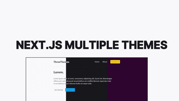
Most theming setups stop at light and dark mode. You wrap your app in next-themes, toggle a class on <html>, and call it done. But I wanted to go further — multiple named color themes, each with its own palette, all working alongside the existing light/dark toggle. Think the kind of theme picker you see in shadcn's registry or VS Code.
A lot of the inspiration here came from tweakcn, a tool for generating and customizing shadcn/ui themes. I used it to generate the actual color values for each of my themes — it outputs the CSS variables directly so you don't have to hand-tune every token. Well worth bookmarking if you're building anything with shadcn.
The challenge is that next-themes is only designed for the light/dark toggle. It has no concept of a separate color dimension. So I built a thin layer on top of it.
Two Separate Toggles
The key insight is that light/dark and color theme are two separate things that don't need to know about each other:
- Light/dark — controls whether backgrounds are light or dark. Managed by
next-themes, stored in localStorage undertheme, applied as thedarkclass on<html>. - Color theme — controls the hue palette (primary, accent, border colors). Managed manually, stored under
color-theme, applied as atheme-*class on<html>.
Because they're separate classes on the same element, they compose naturally. A user can be in dark mode with the supabase color theme, or light mode with bubblegum, and both classes coexist without conflict:
<html class="dark theme-supabase"></html>
Defining Color Themes in CSS
Each theme overrides a set of CSS custom properties. The default theme doesn't need a class — it's just the baseline variables defined on :root. Every other theme scopes its overrides under its class. I generated all of these color values using tweakcn, which lets you visually design a shadcn theme and then exports the full set of CSS variable overrides:
:root {--primary: oklch(0.21 0.006 285.885);--primary-foreground: oklch(0.985 0.002 247.839);--accent: oklch(0.967 0.001 286.375);/* ... */}.theme-bubblegum {--primary: oklch(0.65 0.25 350);--primary-foreground: oklch(0.98 0.01 350);--accent: oklch(0.92 0.08 340);/* ... */}.theme-supabase {--primary: oklch(0.72 0.19 155);--primary-foreground: oklch(0.98 0.01 155);--accent: oklch(0.9 0.06 155);/* ... */}
Because Tailwind's utility classes reference these custom properties (e.g. bg-primary maps to var(--primary)), swapping the theme class instantly re-skins every component that uses semantic color tokens. No component-level changes needed.
The useTheme Hook
Rather than scattering theme logic across the app, I wrapped both toggles into a single useTheme hook that replaces the direct useTheme import from next-themes:
'use client';import * as React from 'react';import { useTheme as useNextTheme } from 'next-themes';export const colorThemes = [Add your own theme names here'default','daggerheart-brews','bubblegum','monochrome','supabase','twitter','vercel',] as const;export type ColorTheme = (typeof colorThemes)[number];export type Theme = 'system' | 'light' | 'dark';export const useTheme = () => {const { setTheme, resolvedTheme } = useNextTheme();const [colorTheme, setColorTheme] = React.useState<ColorTheme>('default');React.useEffect(() => {if (typeof window === 'undefined') return;const saved = localStorage.getItem('color-theme') as ColorTheme | null;if (saved) {setColorTheme(saved);document.documentElement.classList.add(`theme-${saved}`);}}, []);const updateColorTheme = React.useCallback((next: ColorTheme) => {if (typeof window === 'undefined') return;document.documentElement.classList.remove(...colorThemes.map((c) => `theme-${c}`),);if (next !== 'default') {document.documentElement.classList.add(`theme-${next}`);}localStorage.setItem('color-theme', next);setColorTheme(next);}, []);return {setTheme,theme: resolvedTheme as Theme,colorTheme,setColorTheme: updateColorTheme,};};
A few things worth noting:
Initialization reads from localStorage on mount. The useState starts as 'default' to avoid a hydration mismatch (the server doesn't know what's in localStorage), and then the useEffect corrects it client-side and applies the class. This is the same pattern next-themes itself uses.
Switching clears all theme classes before adding the new one. This is important — if you just add the new class without removing the old one, both palettes stack and the result is undefined. Removing all known theme classes first ensures a clean transition.
'default' doesn't get a class added. Since the default palette is defined on :root with no class, adding theme-default would do nothing — and skipping it means we don't need to define a .theme-default selector just to reset to the baseline.
Building a Theme Picker
With the hook in place, a theme picker is straightforward:
const ThemePicker = () => {const { colorTheme, setColorTheme } = useTheme();return (<div className='flex flex-wrap gap-2'>{colorThemes.map((t) => (<buttonkey={t}onClick={() => setColorTheme(t)}className={cn('rounded-full border px-3 py-1 text-sm capitalize transition-colors',colorTheme === t? 'border-primary bg-primary text-primary-foreground': 'border-border bg-background text-muted-foreground hover:border-primary',)}>{t}</button>))}</div>);};
Because the component uses semantic tokens (bg-primary, text-primary-foreground), it automatically re-skins itself when the theme changes — no special casing needed.
Adding a New Theme
The process for adding a new theme is:
- Add the name to the
colorThemesarray in the hook - Define
.theme-<name>in your CSS with overrides for whatever variables you want to change
That's it. The hook, the picker, and the persistence all work without any changes. I find this to be one of the cleanest parts of the approach — the theme registry is just a TypeScript const array, so it's type-safe and easy to extend.
Why Not a Theme Provider?
You could wrap this in a context provider to avoid prop-drilling the hook values, but in practice I haven't needed it. useTheme is cheap — it reads from a React state that's co-located with the localStorage effect — and the hook can be called in any component that needs it without meaningful overhead. If your app has deeply nested theme-aware components, a provider is a reasonable addition, but for most cases the hook is enough.
The full hook is available in my registry if you want to drop it directly into your project.